
Fonts are more than just letters on a page, they are a key part of visual communication in graphic design. Choosing the right font style can drastically influence how a message is perceived, and it can make the difference between an effective design and one that falls flat. This guide explores the essentials of using font styles in graphic design, offering tips and insights for both beginners and experienced designers.
Understanding Font Categories
The first step in using font styles effectively is understanding the main categories of fonts. Fonts are typically grouped into five main categories:
Serif Fonts – These fonts have small lines or strokes attached to the ends of letters. They are traditional, formal, and often associated with reliability and professionalism
Sans Serif Fonts – Clean and modern, sans serif fonts do not have the decorative strokes of serif fonts. They are commonly used in digital design because of their readability on screens.
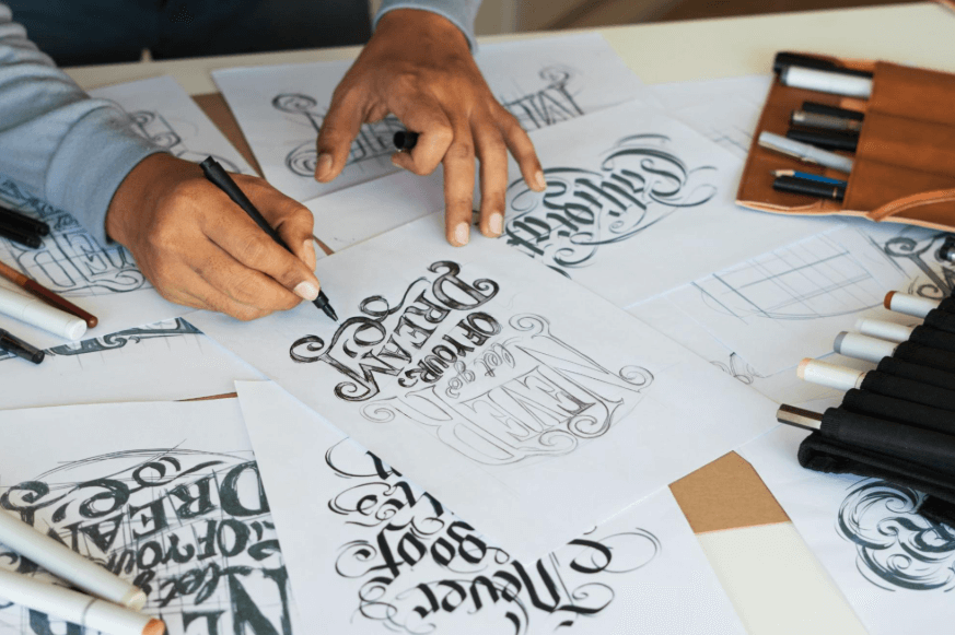
Script Fonts – These mimic cursive handwriting and convey elegance, creativity, or personality. Script fonts work well for invitations, logos, and titles, but they should be used sparingly to maintain readability.
Display Fonts – Designed to be eye-catching, display fonts are often used for headlines, posters, and branding. They can be bold, decorative, or unconventional.
Monospaced Fonts – Each letter in a monospaced font occupies the same amount of space. These fonts are typically used in coding environments or to achieve a minimalist or retro look.
Matching Fonts with Purpose
Each font style evokes a different feeling or tone. In graphic design, it’s crucial to align the font with the message you’re trying to convey. For instance:
- Corporate reports or legal documents should use serif fonts to communicate formality and trustworthiness.
- Tech startups or lifestyle brands may lean towards sans serif fonts for a modern, sleek appearance.
- Wedding invitations or fashion brands often use script fonts for a luxurious or romantic feel.
- Posters or promotional material might use display fonts to grab attention quickly.
By matching font style with purpose, designers can reinforce the brand identity and message of the content.
See also: How to Use AI Face Swap Technology to Create Viral Content
Combining Fonts Effectively
Using more than one font in a design can add visual interest, but it must be done carefully. A general rule is to combine no more than two to three fonts in a single project. Here are some best practices for font pairing:
- Contrast is key – Pairing a serif font with a sans serif font can create a pleasing contrast. For example, using Georgia for headings and Helvetica for body text provides both variety and clarity.
- Maintain hierarchy – Use different font styles to establish a visual hierarchy. Headlines, subheadings, and body text should each have a distinct font weight or size to guide the reader’s eye.
- Stick to a theme – All fonts used should complement each other and align with the overall theme or tone of the design.
Conclusion
Font styles are powerful tools in graphic design. When used thoughtfully, they do more than decorate—they direct attention, evoke emotions, and strengthen messages. By understanding font styles categories, matching style with intent, combining fonts with care, and adjusting spacing and weight, designers can harness typography to create compelling and visually appealing designs. Whether working on a brand identity, website, or print material, mastering font use is essential for any successful graphic design project.